Grooveloop
Created for musicians by musicians. Grooveloop reimagines the metronome in a fun and flexible way allowing musicians to visually create loops of complex rhythms. Part practice tool, part beat making playground.
Platform: IOS
Role: Product/UX/UI Designer
Credit: Kieran Harper (Engineer/Developer)
Download link here
Context
Grooveloop was an experimental project to explore different ways of visually creating musical beats. It was also a creative design and engineering exercise to push the boundary of what we could do within the IOS platform. There were a lot of learnings and development from this project such as the in-app store, animations, transition and sound libraries were later utilised for other projects
Problem and Challenge
The problem we were trying to solve was how to maximise screen space for beats creation while doing it in a fun and exciting way, we also gave ourselves the challenge to create an app where the UI would feel like it is floating and happening within one space without any obvious screen transitions.
Grooveloop main screens
Solution
To created this app we have decided to customise every component of the app, no standard IOS elements were used:
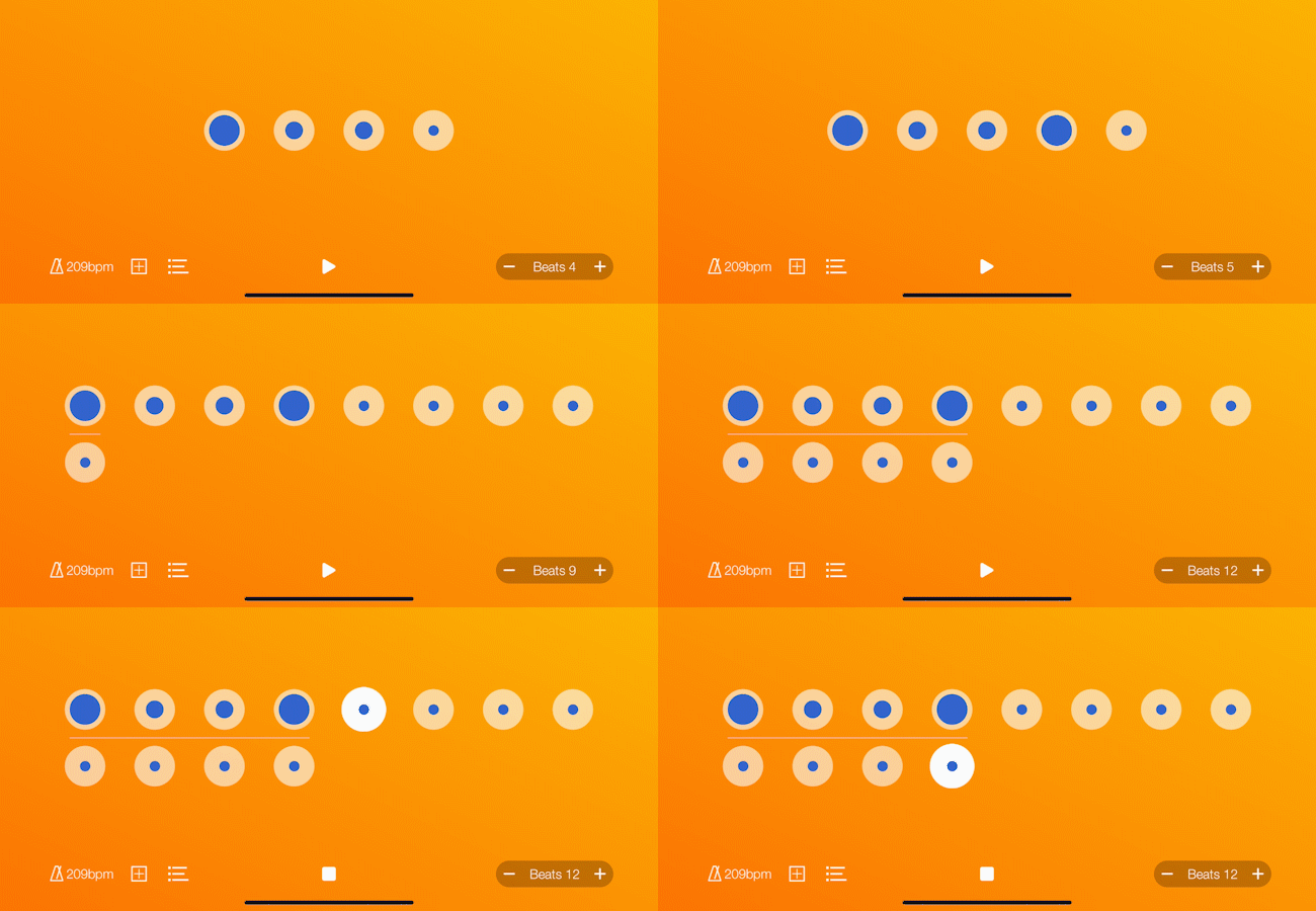
Creative screen space was maximised by avoiding keyboard inputs. To control the app everything had to be done by a tap, swipe, and gestures.
Screen transitions were ‘hidden’ by visually making it seem like the information and buttons were utilising the same background
Features were revealed and hidden through animations and strategic placement of icons to avoid shifting or covering up the beat making space.
To make the experience fun, users were able to pick and choose background colour themes and different sounds for making beats.
Creating beats (Gif)
Animations and transitions (Gif)


